
Brand Refresh
Design System, Digital Design, UI Design, A/B Testing, Conversion Optimization
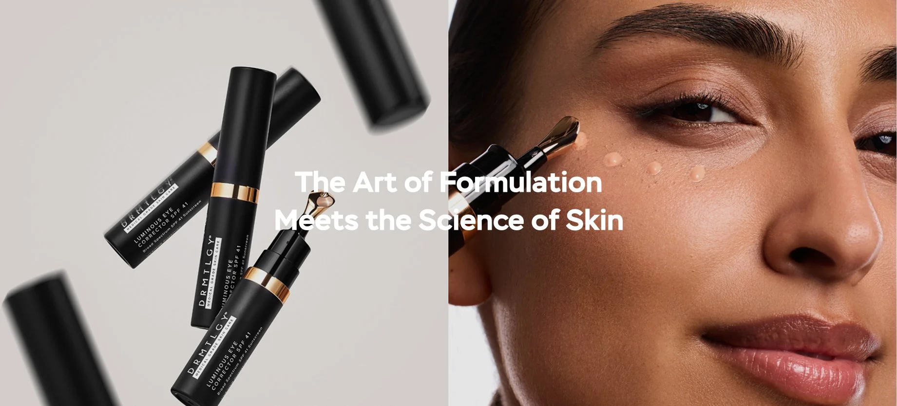
ContextWhy the brand needed a refresh
The existing brand had a clinical aesthetic that worked early on — but as the company grew, it no longer reflected where the brand was heading. The refresh was a deliberate shift toward something warmer, more editorial, and more premium. A new visual positioning was developed by an external agency. My role was to translate the brand refresh into a scalable Figma design system. Then, apply it all digital touchpoints and build templates.
Before
(2022–2025)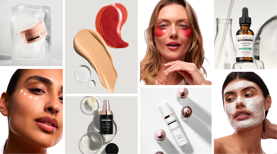
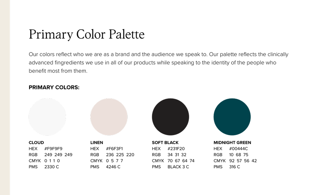
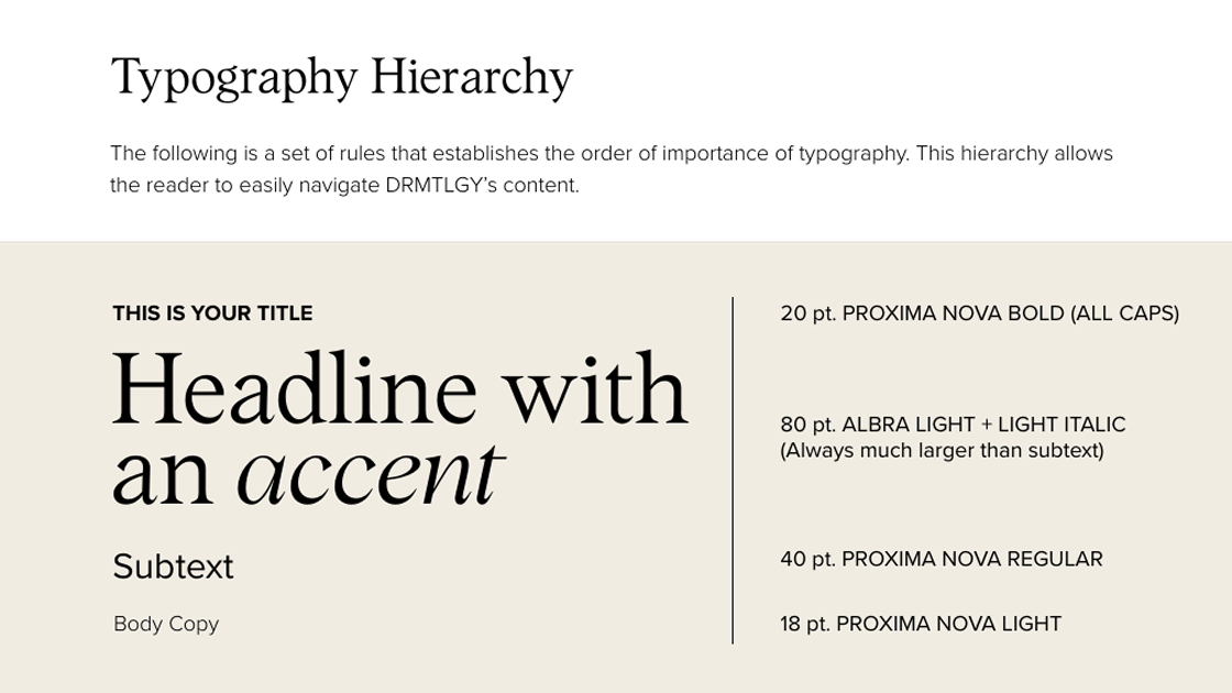
The visual identity is clean and clinical, led by a restrained color palette of cloud white, linen, and midnight green, with Albra and Proxima Nova as its typographic foundation. Photography standards call for high-quality imagery with ample breathing room, bright natural light, and a strong focus on diversity. At its core, the brand positions itself as the "smart best friend who just happens to be a dermatologist."
The New Look
(2026–Present)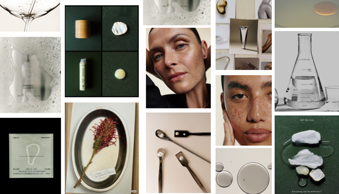
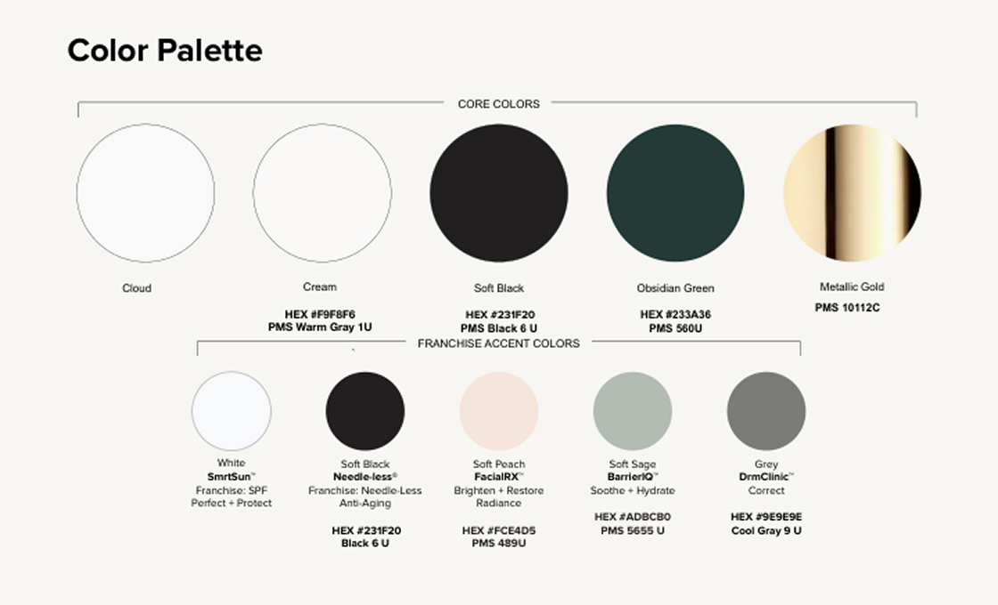
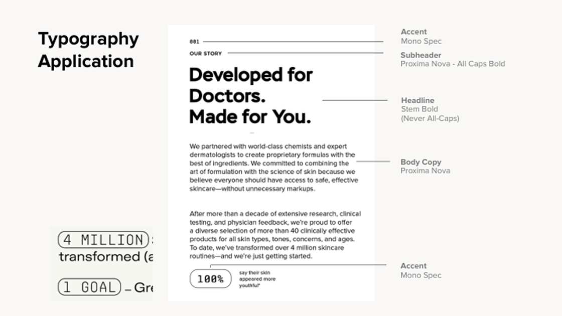
The brand underwent a visual refresh to better reflect its evolution as a premium, science-backed skincare label. The updated identity introduced a more editorial aesthetic while maintaining accessibility at its core.
The palette shifted toward deeper, grounded tones: obsidian green, soft black, and metallic gold. Typography moved to Stem for headlines, Proxima Nova for body, and Mono Spec as a technical accent. Photography direction emphasized dynamic on-figure imagery with soft, glowing light and natural movement.
Product Detail Page Redesign
I led the translation of a brand refresh into a scalable Figma design system, defining the digital design language across typography, color, UI components, templates, homepage, product detail pages, email, and social to ensure consistency across every touchpoint. Let’s look into the ground-up redesign of the core PDP template — elevating brand perception, tightening mobile UX, and delivering a measurable lift in conversion.

The Problem3 things that needed to change
01 Brand ElevationThe layout felt clinical and dated. Lifestyle imagery wasn't leading the experience — product proof was buried.
02 Mobile UXA 3:4 carousel ratio was underselling the product on mobile. The format created scroll friction and compressed key visual moments.
03 Content HierarchyThe page wasn't guiding the buy decision. Benefit framing, social proof, and clinical results competed for attention without a clear order.
ApproachRestructured from the top down
Audited the existing page against conversion best practices and the brand's visual standards — identifying where the layout was losing the customer.
01
Redesigned the image carousel from 3:4 to 1:1 ratio — improving mobile performance and giving lifestyle imagery the room it needed to land.
02
Restructured content hierarchy — lifestyle imagery leads, benefit framing follows, clinical proof closes. Designed to move the customer through a clear decision arc.
03
Added a "4 Reasons" benefit module above the clinical results section — giving customers a reason to care before giving them data to trust.
04
PART 01PDP Carousel
The original PDP used 3:4 portrait images -- functional, but undersized for a product-first skincare context. Switching to 1:1 gave the product more visual mass, reduced dead space on mobile, and created a consistent gallery feel across the carousel. The redesign was A/B tested against existing PDPs and drove a +8.9% conversion rate uplift -- becoming the imagery standard for every product launch that followed.
Before
3:4 portrait images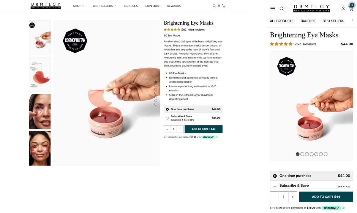
After
switching to a 1:1 format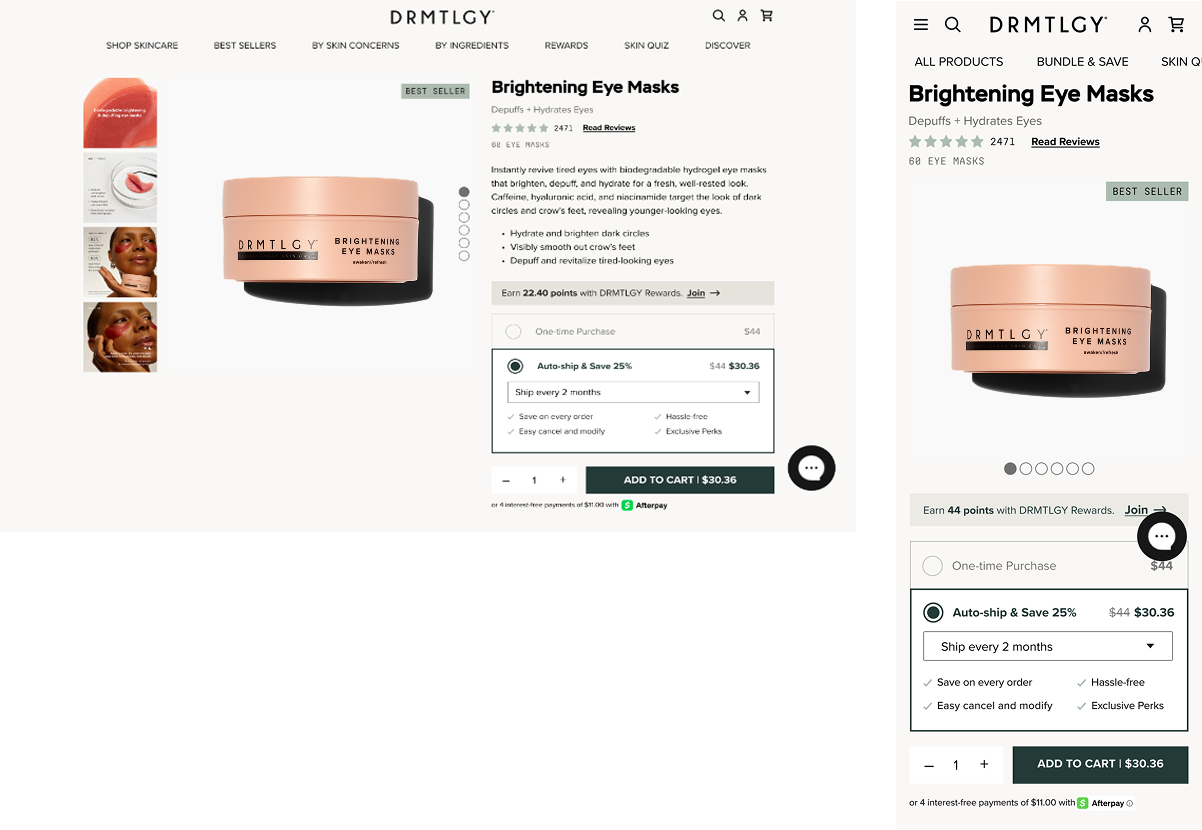
The Redesign Drove a +8.9% Conversion Rate Uplift
The original carousel had no governing format -- images varied in crop, height, and visual weight, and model shots ran without supporting copy or context, leaving strong photography without a job to do.
The 3:4 to 1:1 shift wasn't just a crop change. It required rebuilding the entire content strategy from scratch. Each image was redesigned with a defined role: product hero, texture story, ingredient education, clinical proof, lifestyle context, and routine cross-sell. The result is a gallery with clear visual architecture that moves the shopper from first impression to purchase rationale.
3:4 portrait images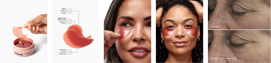
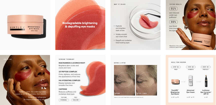
Switching to a 1:1 format ✅PART 02Clinical Claims
The original clinical claims section led with raw percentages and no visual context -- numbers without a story. The redesign anchored the stats to product photography, introduced a badge treatment that signals credibility without feeling cold, and added a benefit-driven "4 Reasons" module to convert ingredient features into purchase rationale. The result is a section that earns trust and sells simultaneously.
Before
desktop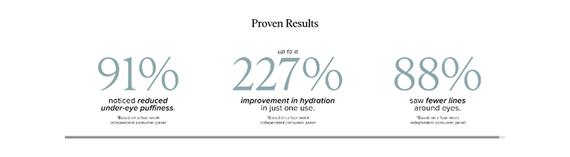
After
desktop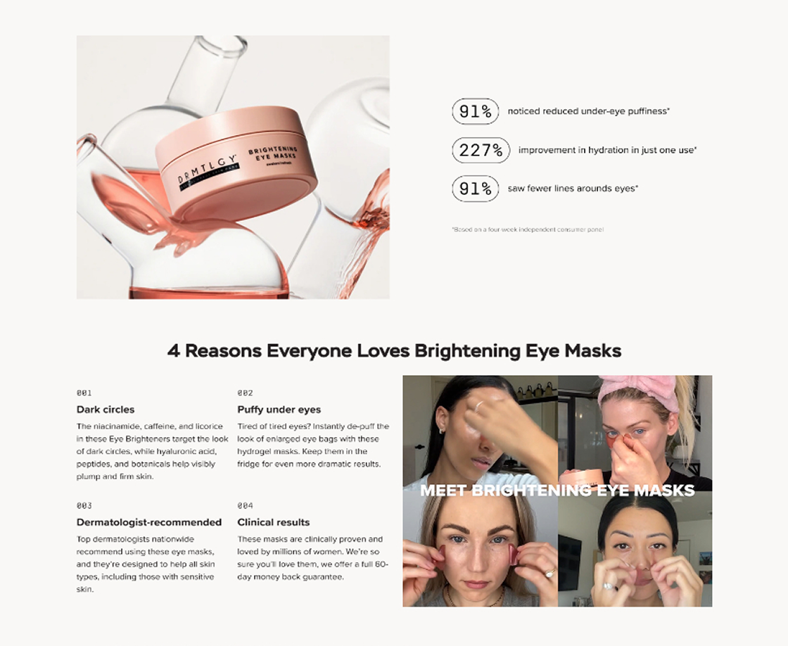
PART 03Before & After Results
The original results section let the before/after images do all the work -- no data, no context, no product connection. The redesign built a proof ecosystem around the image: a social proof header anchoring scale, circle annotation directing the eye to visible improvement zones, contextual stat callouts pulled from clinical data, and tagged benefit labels that make results scannable.
Before
desktop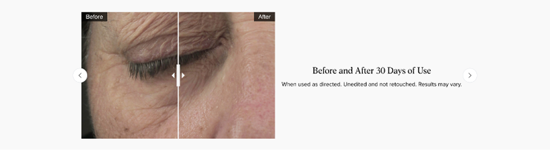
After
desktop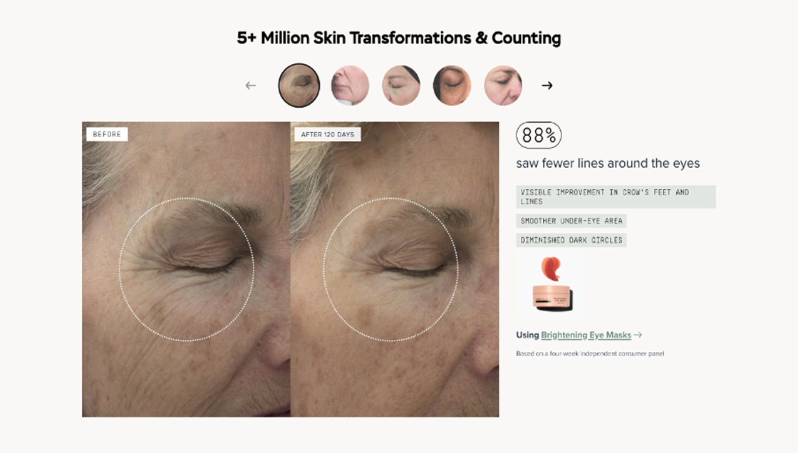
PART 04Skin Types & Concerns
The original section reduced skin type compatibility to a single stacked icon -- easy to miss, impossible to scan. The redesign expanded it into a structured two-column module separating Skin Concerns from Skin Types, with labeled iconography for each condition. Shoppers can immediately self-qualify, reducing friction at a key decision point.
Before
desktop
After
desktop
The New Look
Every section redesigned, every decision deliberate. The updated PDP applies the new brand language end-to-end -- from carousel to clinical claims, benefit framing to routine cross-sell -- built as a scalable template that carried forward to every product launch that followed.
